Create a design system
The act of creating a design system is very easy. After loading the application, click on the Your Design Systems entry in the left navigation menu. If you do not see this item in your left nav bar, click on the icon in the upper left of the application to return to the root of the Theme Builder application. After clicking on Your Design Systems, click on the Create a New Design System button. You will be presented with a popup window. Enter a name for this new design system and then click the Next button.
The steps below will help you initialize a Theme Builder design system.
Step 1. Populate your color palette
A design system in Theme Builder has humble beginnings. When a new design system is created in Theme Builder, you, the author, are initially restricted to very few actions. You must first define a color palette. This will be the collection of colors from which themes can be defined. You may decide to define a color for every color that exists in your company's brand or just the subset that will be used by a specific application. However, at least one color must be present in the color palette before you can progress to the next stage, defining the default theme for the design system.
Add a color to the color palette
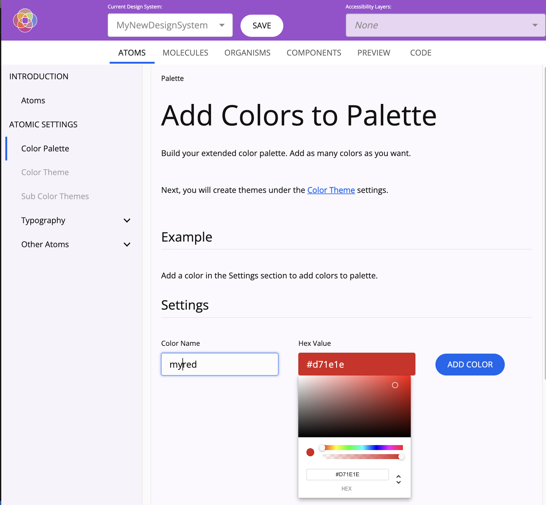
- Make sure that
Color Palettehas been selected from theATOMIC SETTINGSsection on the left navigation menu. - Specify the name of the color that you are adding.
- Select the color from the Color Picker.
- Click
Add Color.
You will be presented with the list of colors in the palette, as rows of 10 shades. Add as many colors as desired. You may add colors to the color palette in the design system at any time.
Step 2. Select colors for the default color theme
Until the default theme is complete, no other parts of the design system will be configurable.
Specify colors

- Make sure that
Color Themehas been selected from theATOMIC SETTINGSsection on the left navigation menu. - Select primary, secondary and tertiary colors. For each of these values, you will be allowed to choose from the tray of shades that will be generated from each color available in the color palette. Once these three colors are defined, you will be free to draw upon these colors and their shades to define which will be used for various aspects of the default theme (such as background colors, button colors and icon colors).
- Note:
- Unless all three colors are selected, some of the subsequent fields (e.g. button, icon) may not be selectable.
- If you change the values of the primary, secondary or tertiary colors after subsequent fields have been configured, all subsequent field values will be cleared to prevent potentially invalid field values from being saved.
- Values for all fields must be specified to proceed to the next step.
- Note:
- Click
Show Themeto indicate that you are satisfied with the default theme.
Note: Once you have confirmed your decision, you will be presented with a read-only representation of all of the values that you selected, displayed in light mode and dark mode. At this point, the default theme will no longer be modifiable. The reason behind this is that changes to the default theme, after other parts of the design system are configured, could largely invalidate those selections. In a future version, creating sub themes will be possible which will overlay the default color theme; thus allowing for a modifiable color theme in your design system.
You may want to save your design system at this point to serve as a foundation from which to populate future design systems or as a safe restore point from which to begin again.
Upon establishing the default theme, Theme Builder will now allow you to modify any aspect of the design system that you wish. To begin, we lightly suggest that you define values at the atom level initially and progress next to the molecules.
Step 3. Select Typography values
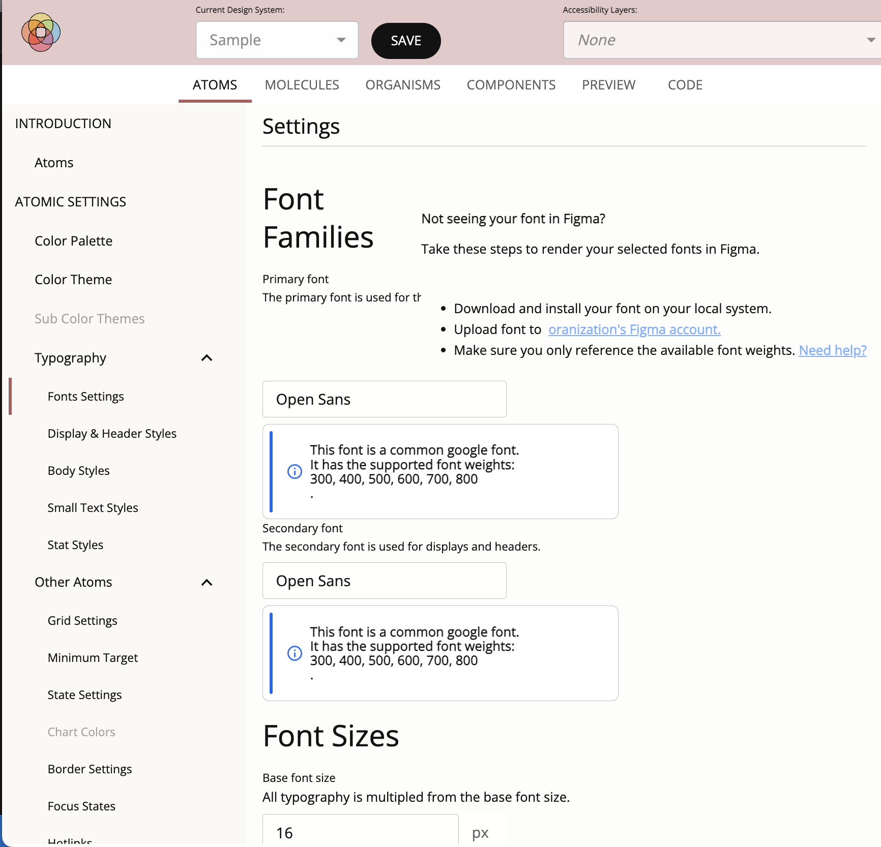
Along with coloring, selecting a good font will provide a great foundation for styling your application. More information on configuring the Typography in your design system can be found here.
Interlude: Helpful Insights
As you grow more satisfied with the style that you are achieving, feel free to progress to more complex combinations like organisms. You may notice that some colors you select, for example in State Settings, will not be used by Theme Builder. It may choose to use similar, though slightly different, colors. This is by design. In order to meet the requirements set out in the accessibility guidelines, some colors cannot be used in combination with others as contrast ratios limits have to be observed. Similarly, you may find yourself unable to change some settings. For example, you may not be given the ability to choose to not underline hotlinks. Again, to be compliant with the standards, hotlinks must be easily differentiated from its background and the text that surrounds it. Based on the background and hotlink colors that you selected, this differentiation may only be achievable by underlining the hotlink.
So how can you evaluate your new design system? One thing that you may notice as you use Theme Builder is that the tool itself uses many of the CSS variables that are being affected by your choices. Button shapes and colors, border shades and elevations and many other visual cues in its user interface will change to reflect the values you selected. This allows you to be immersed in the design and feel it for yourself. Theme Builder also provides tabs like Preview and Components which collect many of the most popular atoms and molecules together to form more complex components and views where the styling that you have been composing can be exhibited in very tangible ways.
Other Atoms
The other atoms in Theme Builder are a bit less visible than colors and typopgraphy, but no less important. As with the color and typography settings, these atom values will be shared across your application as you develop more complex components. In this section you'll be able define the spacing and click area of elements, their border size and radii, how textfields look by default and when they have focus, whether hotlinks are underlined, how pronounced elevation and bevels are, and animation settings.
Molecules
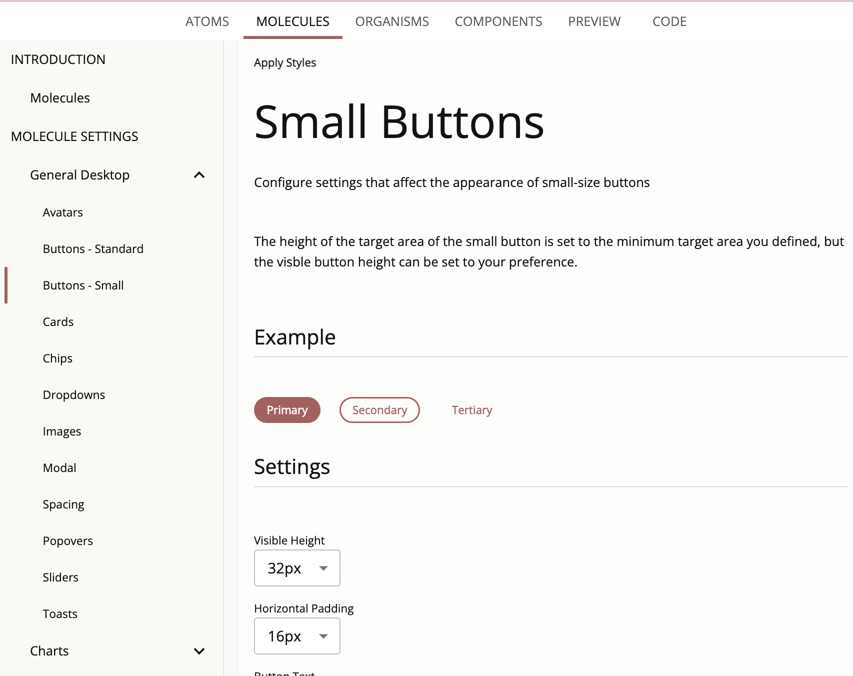
The molecules in Theme Builder roughly approximate the components available in most component libraries. While many of these components will already reflect the atom settings you have initialized, the molecule settings allows you to set some important characteristics on each specific type of component. You'll be able to configure settings such as border values unique to avatars, dropdown menu item highligting, section and paragraph spacing and text, padding, bevels and elevations on buttons, cards, chips, images, modal dialogs, popovers, sliders and toasts.
Organisms
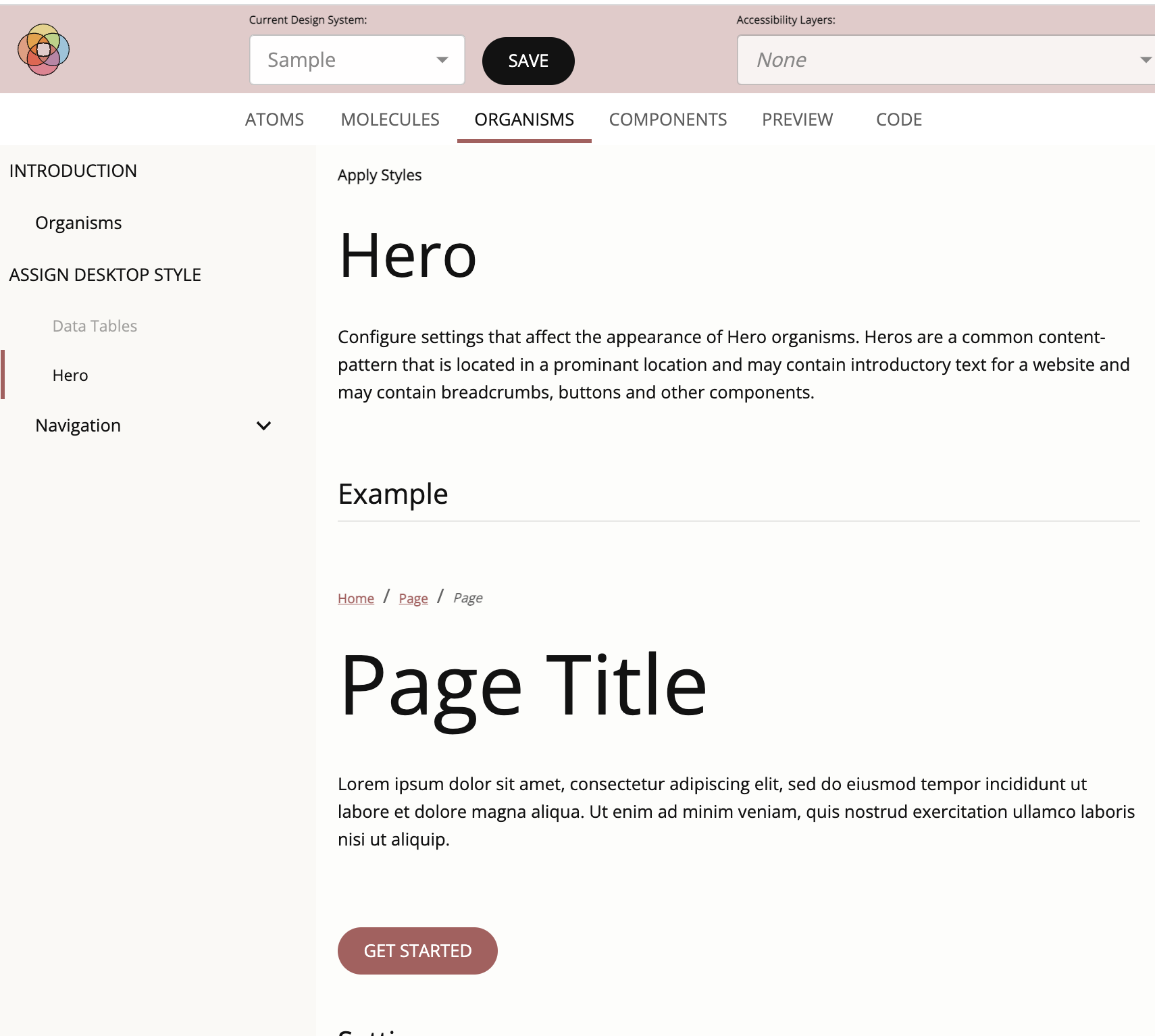
The organisms in Theme Builder today are just a taste for what could be imagined and further developed by the community. Organisms are built from atom and molecule components to achieve a richer experience for the end user. Currently Theme Builder allows you to provide values to hero organism settings which will affect a hero's font size and spacing. It also allows you to preview a variety of heroes using these values.
Components
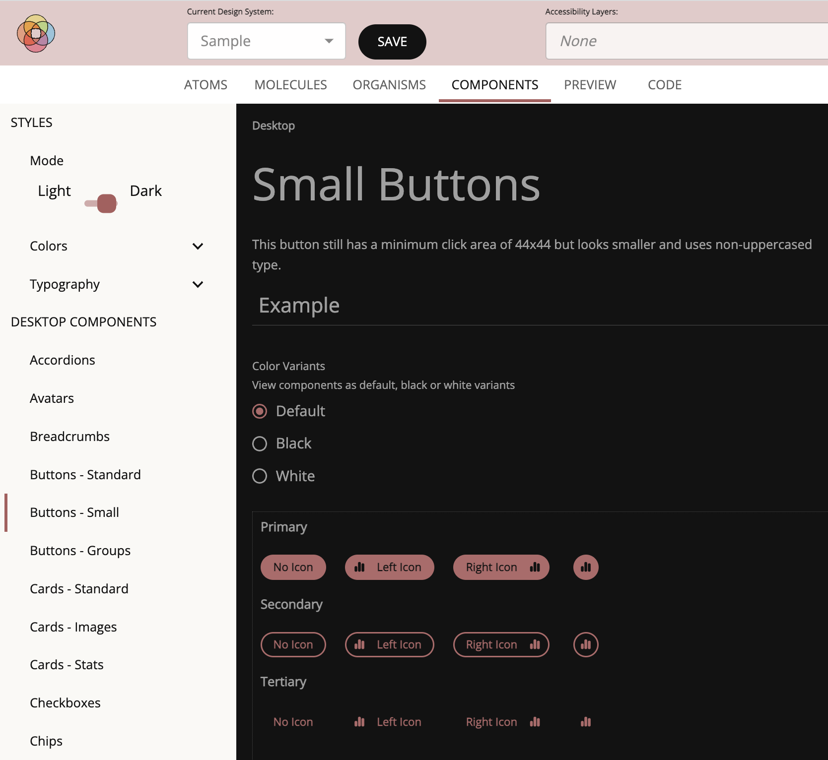
The Components tab in Theme Builder is similar to the molecules section in that the components that comprise this part of the application are the most popular widgets used in web and mobile applications. However, this section is meant only to reflect the values that have already been chosen and does not allow you to further configure the design system. Here you'll be able to see many of the color and typography settings that have been specified as well as displaying the wide array of components in isolation, reflecting their current settings against a variety of backgrounds. As an example, you'll be able to see what small and large buttons, with and without icons, will look like with their current padding, border, bevels and elevation settings against the default background color as well as black and white background colors.
Preview
Coming soon...
Where the Components tab showed components in isolation, the Preview tab is meant to collect a large number of these components together and display them in a page much like any number of applications may do. To see them in their natural habitat, so to speak. You'll see widgets like buttons, radio buttons and checkboxes in forms amongst a hero and some paragraphs with proper typography and spacing. As the number of molecules and organisms expand over time and the industry adopts new interaction patterns, so should our Preview.
Code
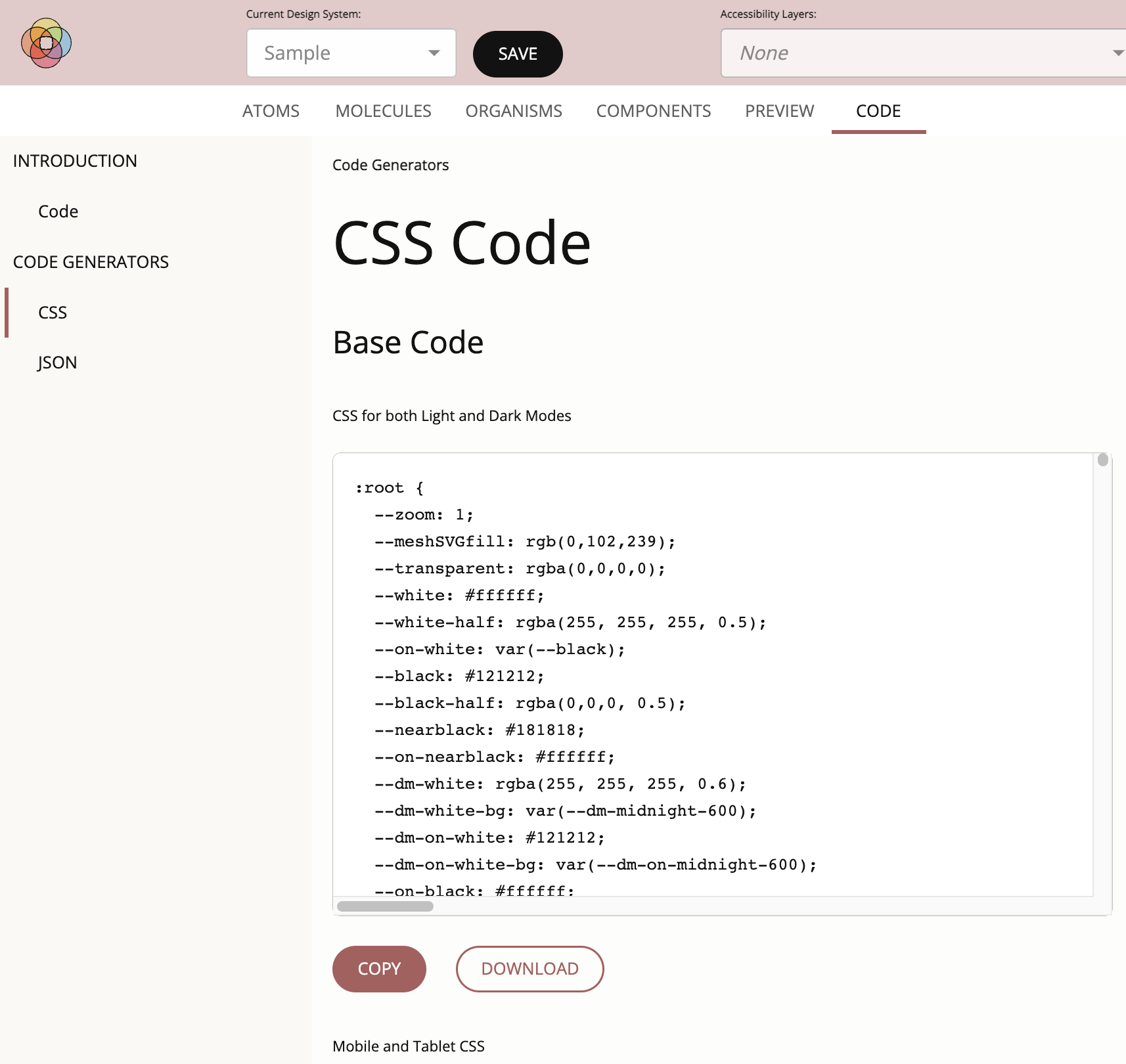
The Code tab will collect all of the styling rules that have been generated by the tool in response to the values that you have set in the atom, molecule and organism sections of the design system. Here you'll be able to see the root CSS variables as well as the CSS overlays that pertain to mobile and each of the selected accessibility layers. To export these values, you'll be able to copy these to your clipboard or download them into files which can then be imported into other tooling.