Extending Atoms, Molecules, or Organisms
This section describes how a developer can extend the Theme Builder application with respect to atomic elements (i.e. atoms, molecules, or organisms).
Although it depends upon your use case, in most cases it will require modifying both:
- the user interface code in the a11y-theme-builder repository (see Extending the User Interface section below), and
- the SDK code in the a11y-theme-builder-sdk repository (see Extending the SDK).
Generally speaking, there are two ways of extending the Theme Builder application with respect to an atomic element:
- Adding an additional property to an existing atomic element, or
- Adding a new atomic element.
The sections below describe how to perform these types of extensions for both the SDK and the User Interface.
Extending the SDK
The code for Design System, and for all of the atomic elements associated with Design System, lives in the SDK. So this is where every journey to extend the design system must begin.
See Extending the SDK.
Extending the User Interface
The User Interface for Theme Builder is largely concerned with administering the currently loaded design system and all of its atomic elements. Each atomic element in the UI is bound to the corresponding atomic element exposed by the design system in the SDK. The UI will represent the atomic element in the UI using examples, the UI will register for listeners to be able to reflect changes to the atomic elements in real time, and the UI will allow the user to manage the properties on the elements.
To begin:
- Ensure that the SDK is extended first with your new additions, and that this newest SDK version is present in your build.
- Create the React component for the new addition you are planning to make. Ensure it is in the correct directory depending on whether it is a atom, molecule, organism or component. Be sure to import the SDK extension you made, and accept it as a property into your React component.
- Complete the new React component, by completing a HeadingSection, ExampleSection and Settings Section.
- Add your new component to the correct content page depending on whether it is a atom, molecule, organism or component. This is where you would pass an atomic element from the design system to a new React component.
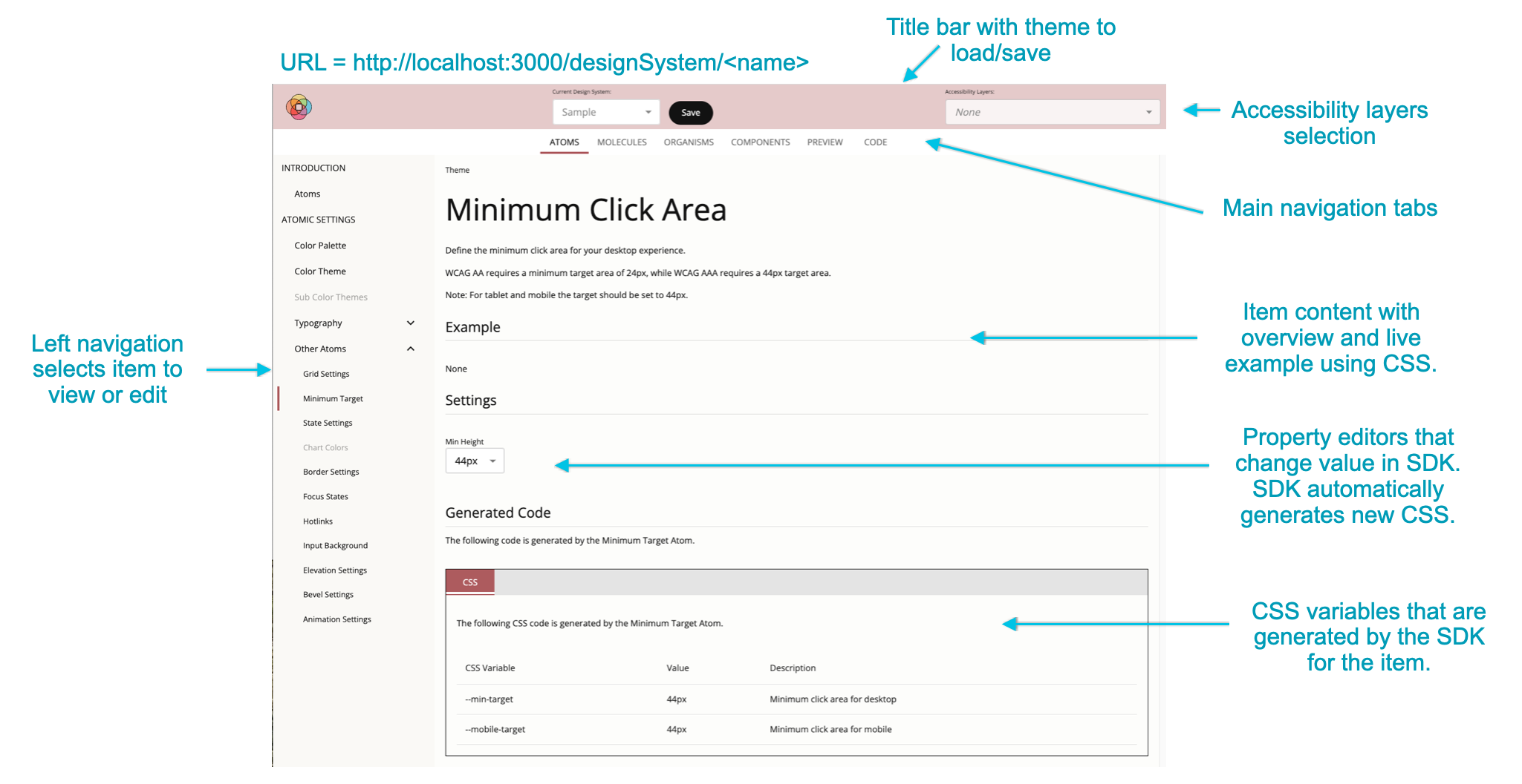
The following image shows the various areas of the Theme Builder editor with the specific files that contribute to its rendering.

- DesignSystemPage.tsx: The design system page. Contains the title area, the horizontal tabs at the top of the page and the content space below the tabs.
- DesignSystemTitleBar.tsx: Title bar area at the top of the page containing the save button and accessibility layers
- AccessibilityLayersButton.tsx: Accessibility layers selection dropdown
- code/src/ui/src/pages/content: Location of the content pages for the main horizontal navigation tabs. The atomic elements in the design system are bound to their UI components in the following pages.
- AtomContent.tsx: Renders all atoms. Contains the left nav bar and content area for the Atoms tab.
- MoleculeContent.tsx: Renders all molecules. Contains the left nav bar and content area for the Molecules tab.
- OrganismContent.tsx: Renders all organisms. Contains the left nav bar and content area for the Organisms tab.
- ComponentsContent.tsx: Renders all components. Contains the left nav bar and content area for the Components tab.
- PreviewContent.tsx: Renders preview content. Contains the left nav bar and content area for the Preview tab.
- CodeContent.tsx: Renders code content. Contains the left nav bar and content area for the Code tab.
- LeftNavTabs.tsx: Each main tab content area has a left navigation list that uses the LeftNavTabs component
- code/src/ui/src/pages/atoms: Location for all atoms
- code/src/ui/src/pages/molecules: Location for all molecules
- code/src/ui/src/pages/organisms: Location for all organisms
- code/src/ui/src/pages/components: Location for all components
- code/src/ui/src/components/editors: Property editors used by atoms, molecules and organisms.
- code/src/ui/src/components: Some color-based property editors used to create the default Color Theme and the Components color swatches are located here.
The pages for all atoms, molecules, organisms and components share a similar layout. This was achieved by utilizing the following components on each page.
- HeadingSection.tsx: Heading section with title and description
- ExampleSection.tsx: Example section
- LightModeSection.tsx: Light mode section used to show rendering for light mode
- DarkModeSection.tsx: Dark mode section used to show rendering for dark mode
- SettingsSection.tsx: Settings section that contains the property editors
- GeneratedCodeSection.tsx: Used by Atom, Molecule and Organism pages. It is a code section that displays the CSS variables managed by the atomic element (atom, molecule or organism) bound to a given page and each variable's real-time value
Walkthrough: Creating a new Atom
We have included an Example Atom as a DEMO.
Follow the comments labeled with DEMO in the above file and the Atom Content Page.
As you develop a new atom, molecule, organism or component and begin defining the style rules that will apply to it, keep in mind that the atomic element needs to be able to render equally well in light or dark mode. For more on this topic, see: Managing Light and Dark Mode.